First impressions are made in seconds, which is why a book’s cover design is so important. While there are some wonderful book covers for the texts used in the high school classroom, there are are also some unappealing cover designs. Usually, the less attractive cover is the movie-tie in cover, and as I collect used texts for the classroom, I try to avoid these commercial texts.
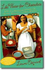
 For example, Like Water for Chocolate was published in 1989 by first-time Mexican novelist Laura Esquivel. This book is an independent choice in grade 10, and there are several trade paperback versions available.
The book’s original cover is a lovely tribute to Diego Rivera; a lovely turquoise border frames a painting of a two women preparing food in a kitchen. One woman sits stirring in a bowl on the left side of the painting; the central figure is dressed in white wistfully stares out to the reader as she molds a tortilla.
The novel follows the story of a young girl named Tita is unable to marry Pedro, the man she loves, because a family tradition which requires her to care for her mother until the day she dies. The book is organized recipe by recipe, each marking Tita’s longing for Pedro. As Tita expresses herself when she cooks, the foods are bewitched with her emotions.
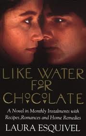
The movie tie-in cover for Like Water for Chocolate is not as charming. There is a close-up photo of Lumi Cavazos (Tita) and Marco Leonardi (Pedro) staring past each other; the effect is rather unsettling rather than engaging.
Likewise, the post-apocalyptic novel The Road by Cormac McCarthy, published in 2006, also has several cover versions. We teach this book in Grade 11. The original design is distinctive and bold with McCarthy’s name (brown ink) and title of the book (white ink) printed large across the front; there are no illustrations. This dramatic choice impresses the reader of both the book’s importance and the starkness of the world contained within. A father and his young son travel down through the Eastern states of a destroyed America. The environment has been destroyed, society has been destroyed, but the man and the boy struggle on maintaining a last hope for humankind. Their relationship, one of tenderness and compassion, is in sharp contrast to the nightmarish future McCarthy creates.
The film The Road was released in 2009 and the trade book movie tie-in cover depicts a weary Viggo Mortensen (the man) and Kodi Smit-McPhee (the boy) trudging down a road against a grey landscape. The mass-market tie-in is even worse with a close up profile of a filthy and distressed Mortensen. Both movie-tie in covers are commercial attempts to capture the book’s hostile setting and compassionate relationship between father and son.
However, there are some movie-tie in covers which are more suited for the material within. The covers for the novel Beloved by Nobel prize-winning author Toni Morrison have undergone multiple transformations, which is confusing at first to many of my Advanced Placement students who may have one of several copies. The 1987 release simply has the title across the cover. This release was an over-sized trade that does not stack well with other books.
Then, there were two paperback covers (1988 and 1994) that shared the same image of a faceless woman in a hat centered on the front. This design more artistically captured a central theme in the novel. When the book was chosen by Oprah for her book club, the book was released again with a red cover and the word Beloved in gold script across the cover.
Of these three designs, the most appropriate cover was the faceless woman whose ghostly image alludes to the character of Beloved, a child murdered in order to prevent her return to slavery. Opening in a post Civil War South, the main character Sethe confronts the ghosts and people from her past, and the evils of slavery are described in painful detail.
The movie-tie paperback cover for the film Beloved (1998) is far more dramatic; the actress Thandie Newton is pictured in side profile, back arched, against distorted tree branch. The result is dramatic without focusing on the film’s actress; this cover is not a blatant movie tie-in.
I rarely buy these movie-tie in paperbacks for two reasons. The art design usually features the actor or actress and not the elements of the story, and these covers immediately alert students that there is a film to watch rather than a book to read! However, the contrast in covers is an interesting lesson for students, and I have asked them which cover they prefer. Can they judge the book by its cover?


